After two decades of a free for all, Cisco once again has a common industrial design language across its product families.
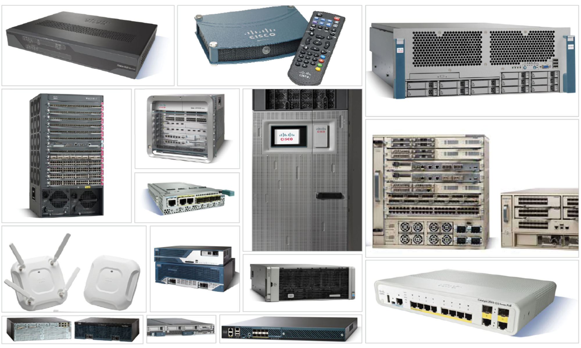
When Cisco was the most valuable company in the world it had a common industrial design language. Like it or not, the green and gray with yellow patch cables meant a Cisco product. If you walked into a data center you instantly knew you were looking at a Cisco Powered Network. But over time, that design language got tired, and in isolation, product managers took it upon themselves to create new design languages for their product families. And it completely splintered the brand identity.
Toss in 170 acquisitions and you get an idea of what the situation was at Cisco. I came up with a simple goal:
Adopt a new industrial design language that reflects the awesomeness that is already inside our products
Just like the Winning with Words and Software Unification programs, we took a human-centered design approach. And followed a simple structure: Evangelize, Engage, and Operationalize. Evangelize the strategy, customer experience, and value to the business. Engage on high value, high return opportunities to show what success looks like. And Operationalize the entire effort so it can scale and be self-sustaining.
While we had initial grassroots support for the software unification program, the hardware effort was the opposite. Within weeks I got executives on board and secured $6 billion in product commitments. We achieved critical mass within a quarter of kicking off the program. We had filled a vacuum, and with it came support up, down, and across all of engineering. It was a grand slam.
We were now laying track while standing on the front of the speeding train. We partnered with the Italian design house Pininfarina to develop an industrial design language that reflected our brand’s essence and would deliver on our brand promise. And it uses the same two principles as my other programs: 1. Make it simpler, 2. Make it more distinctive.
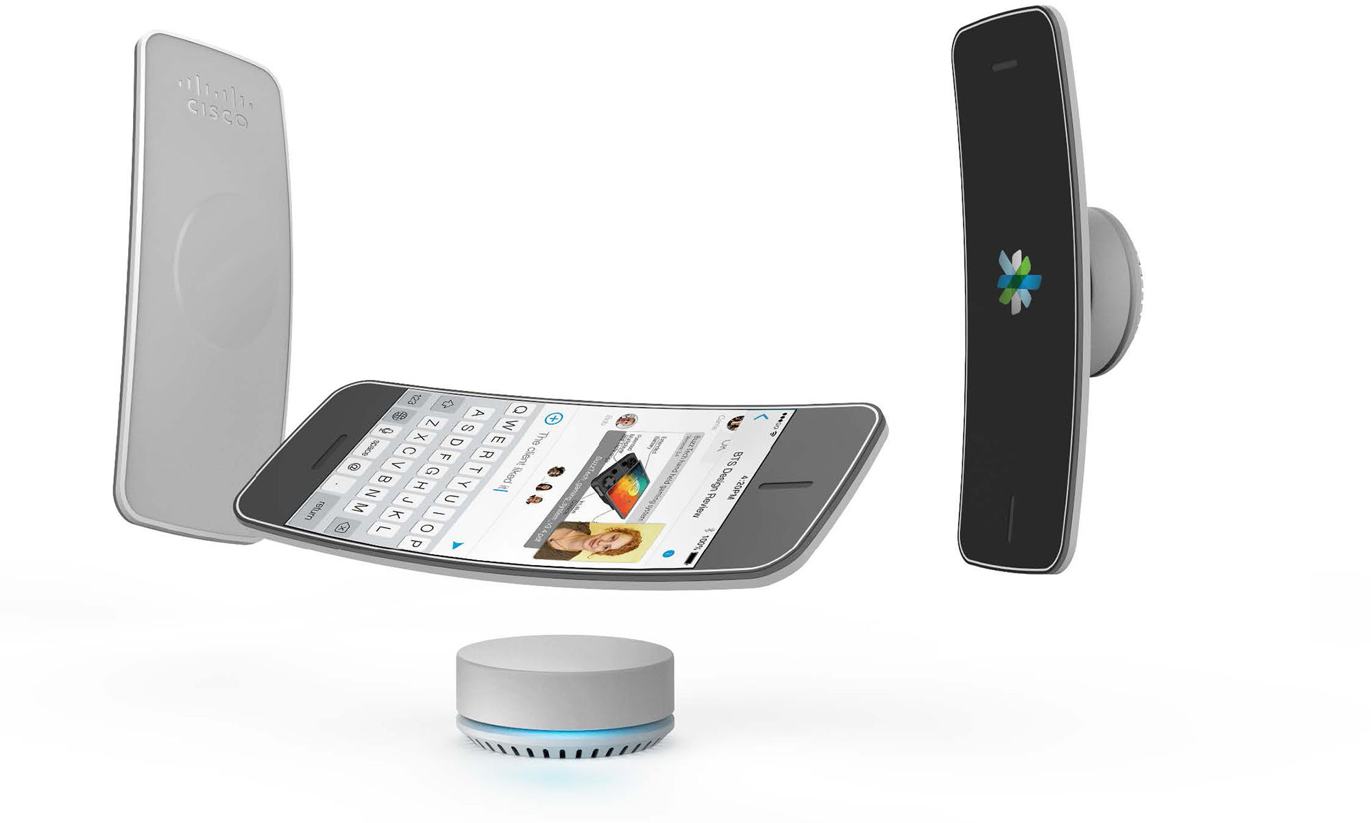
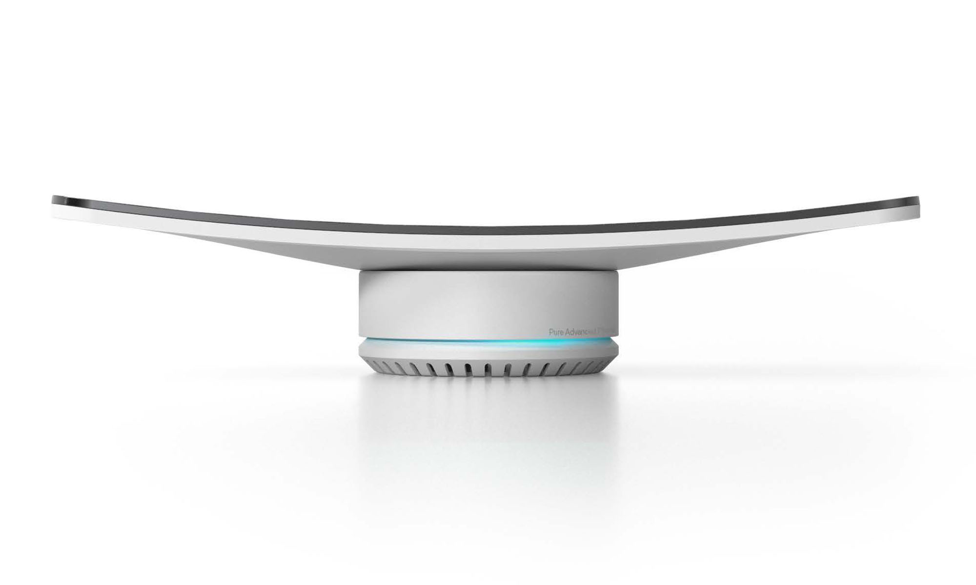
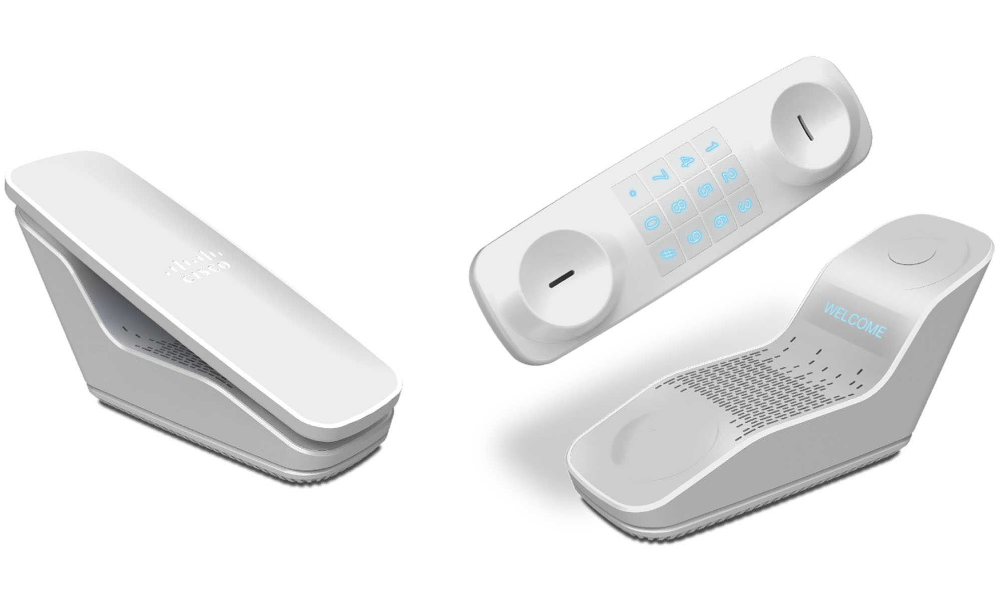
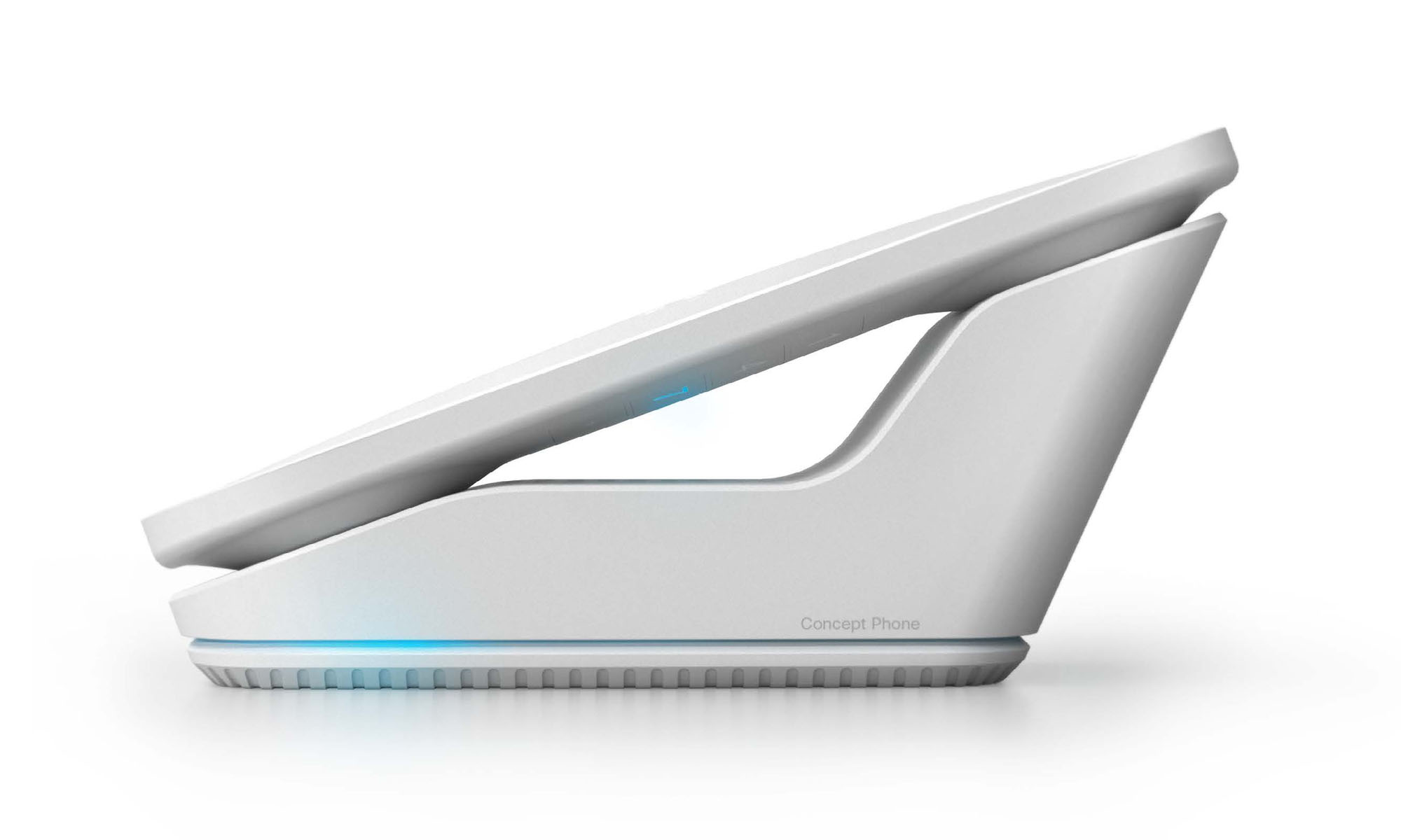
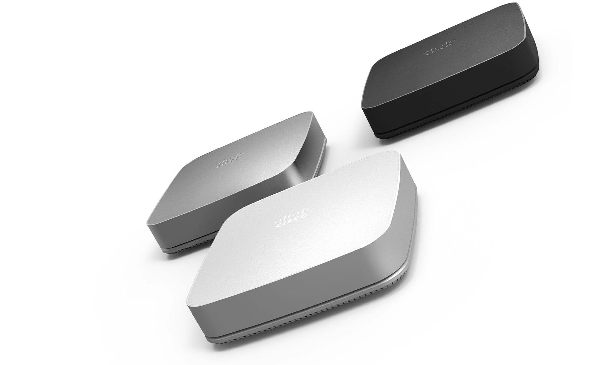
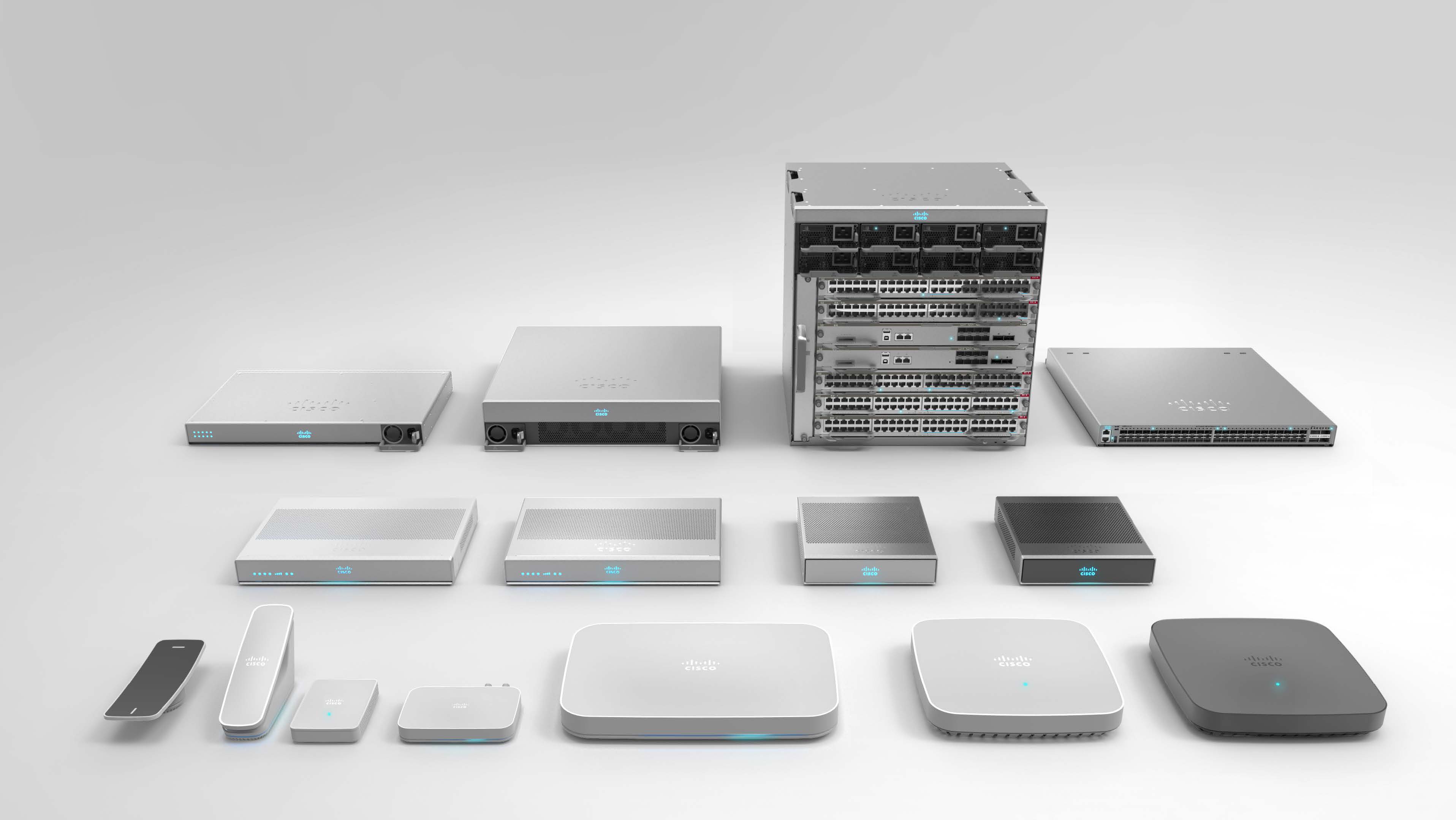
To do that, we had to design a language that could be applied to a $100 phone and to $1M networking products. So we created a common core that could be expressed across all the product families.
One language, two expressions
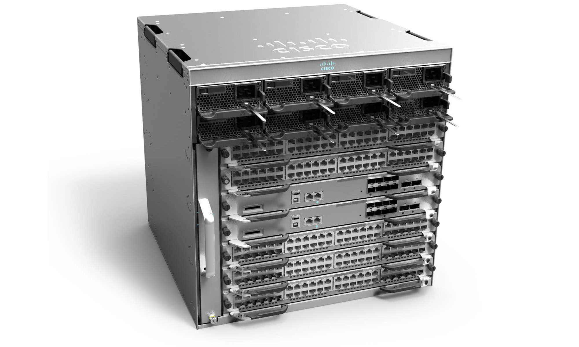
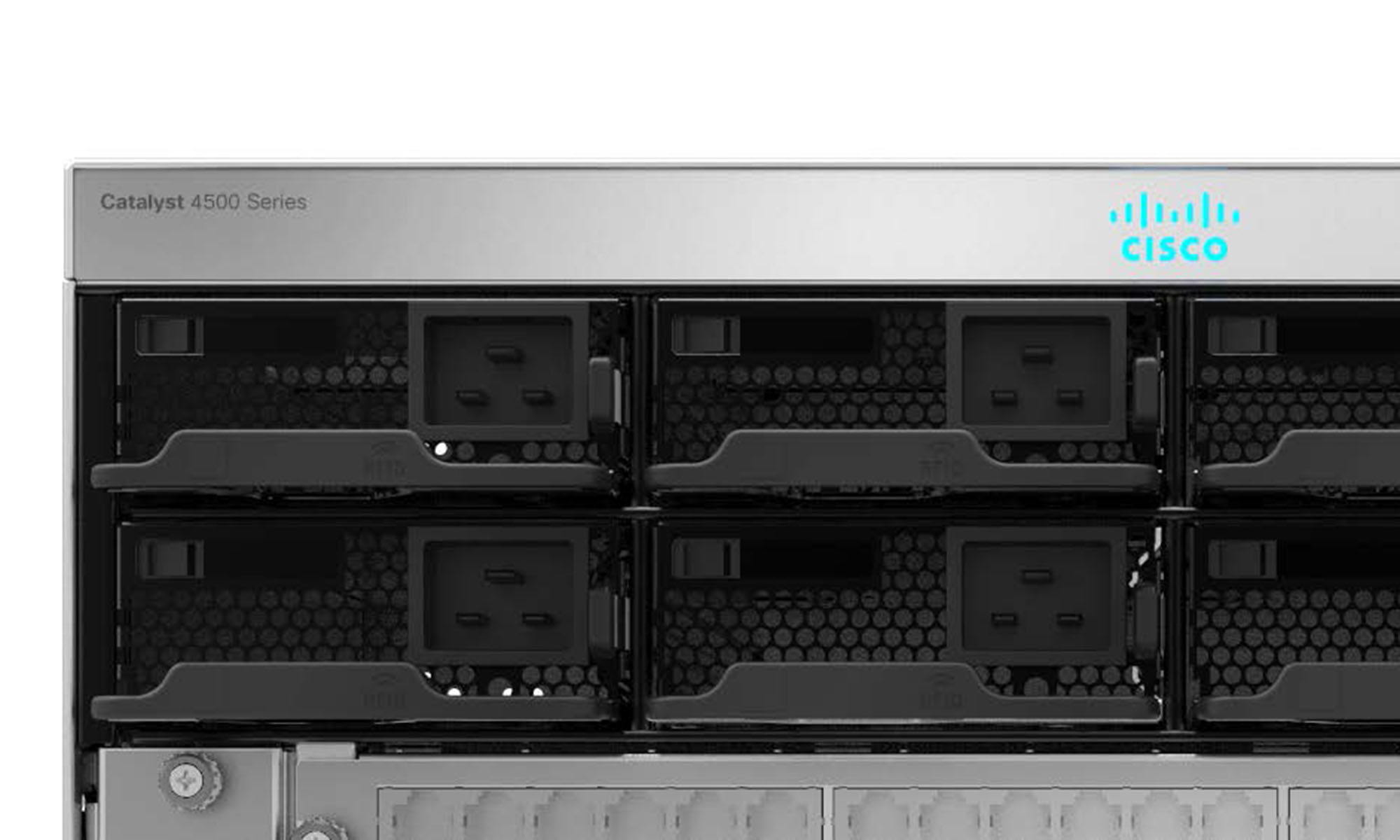
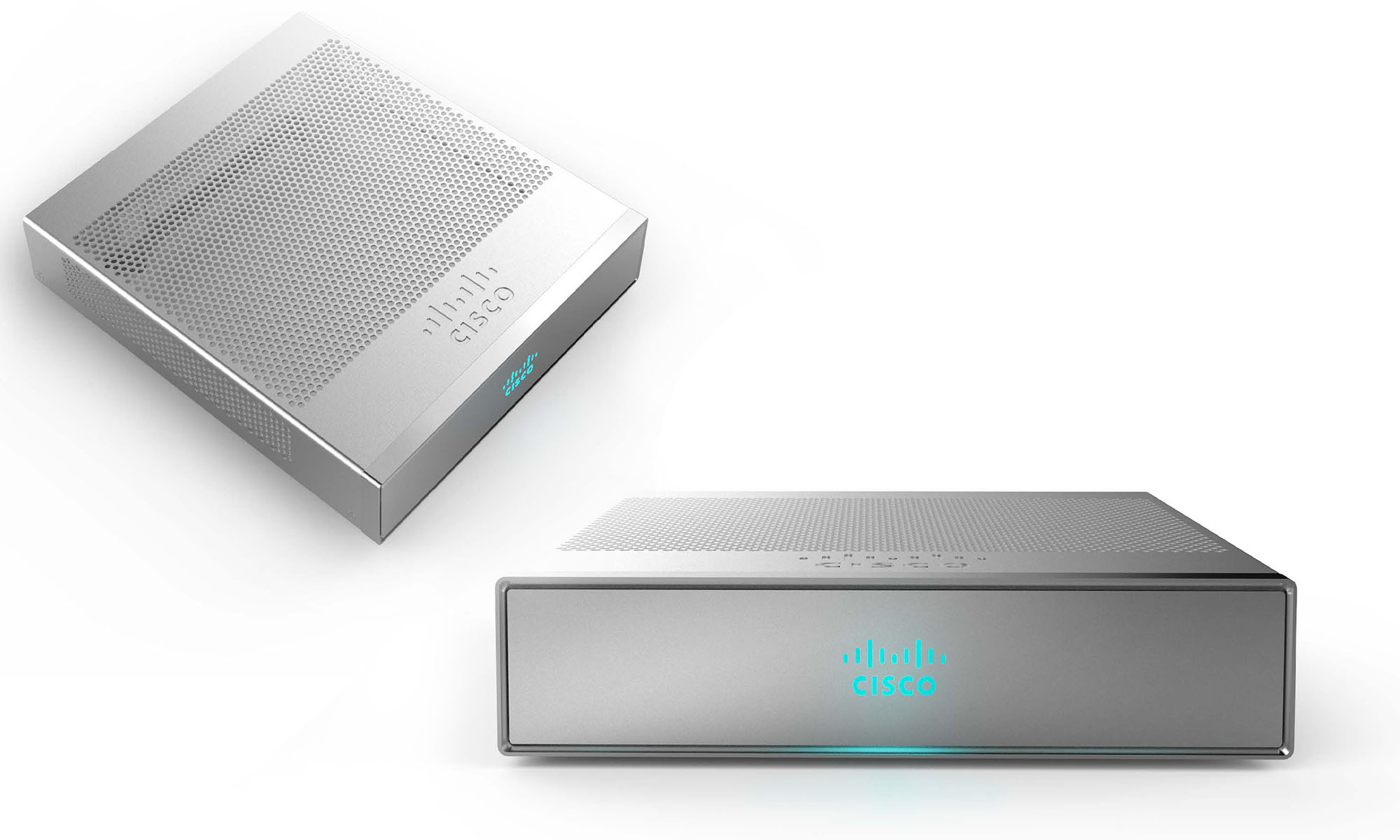
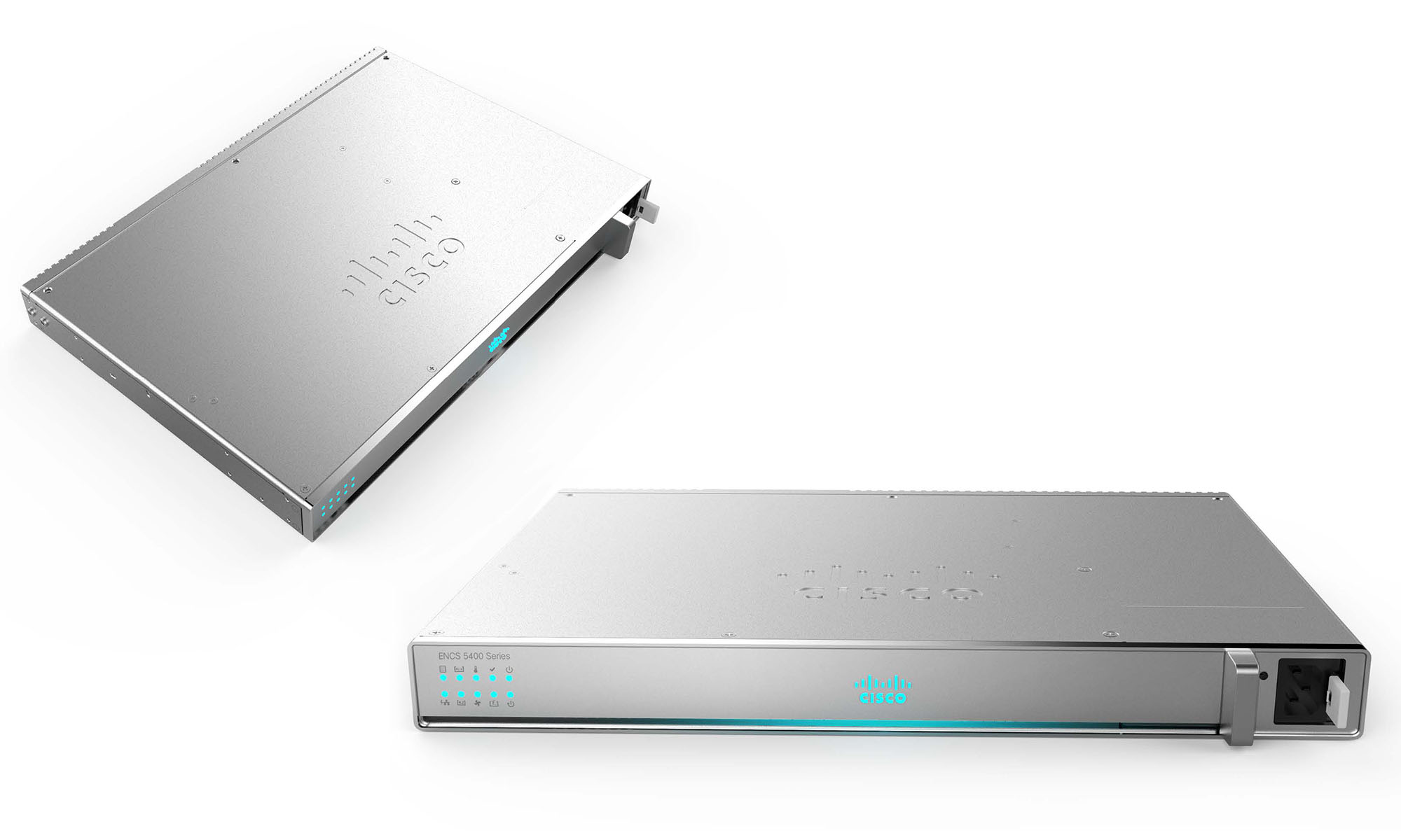
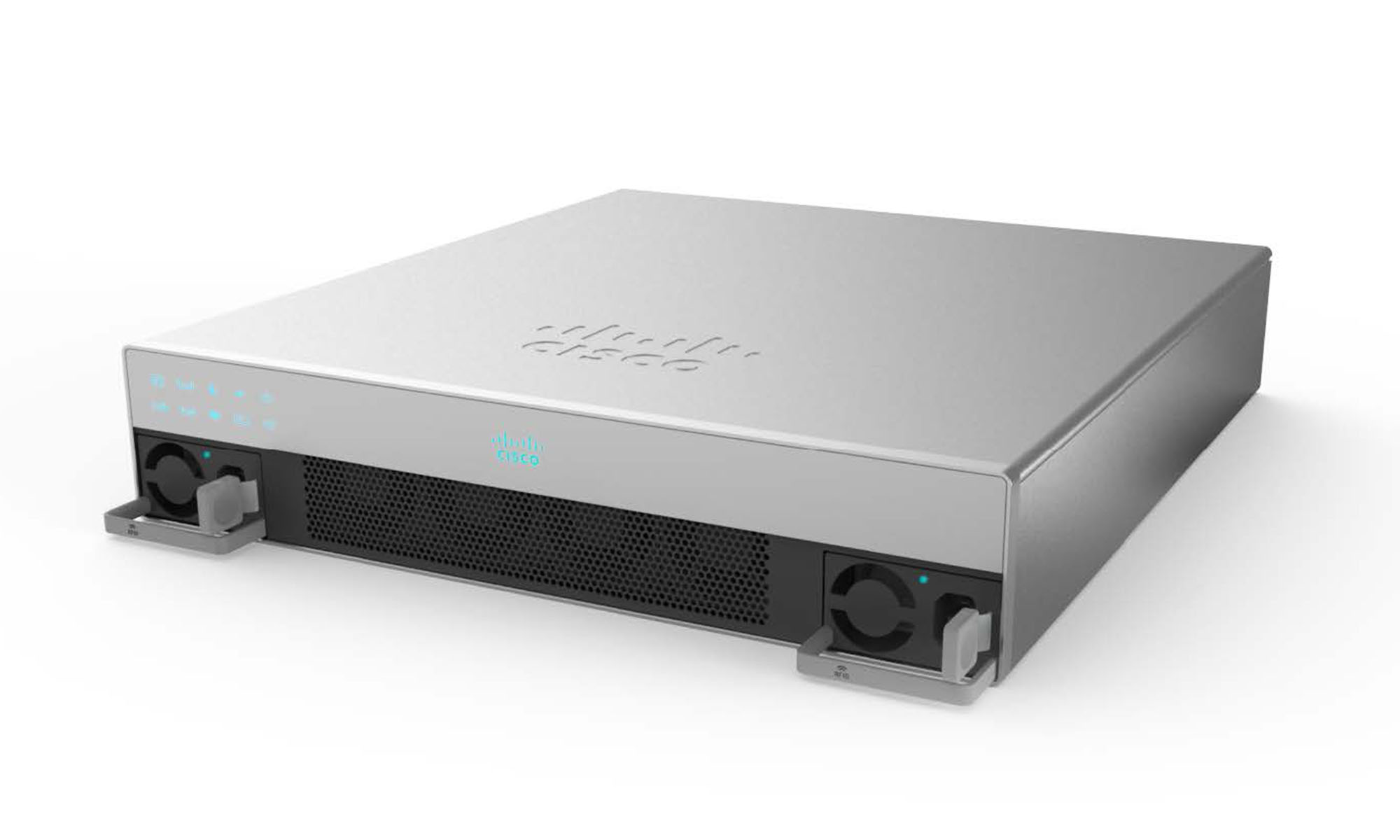
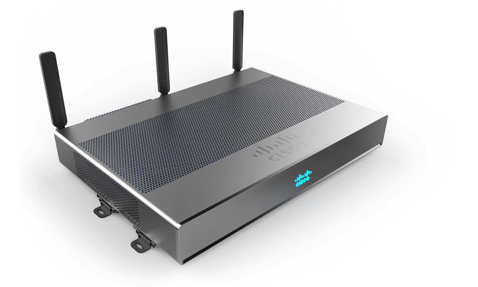
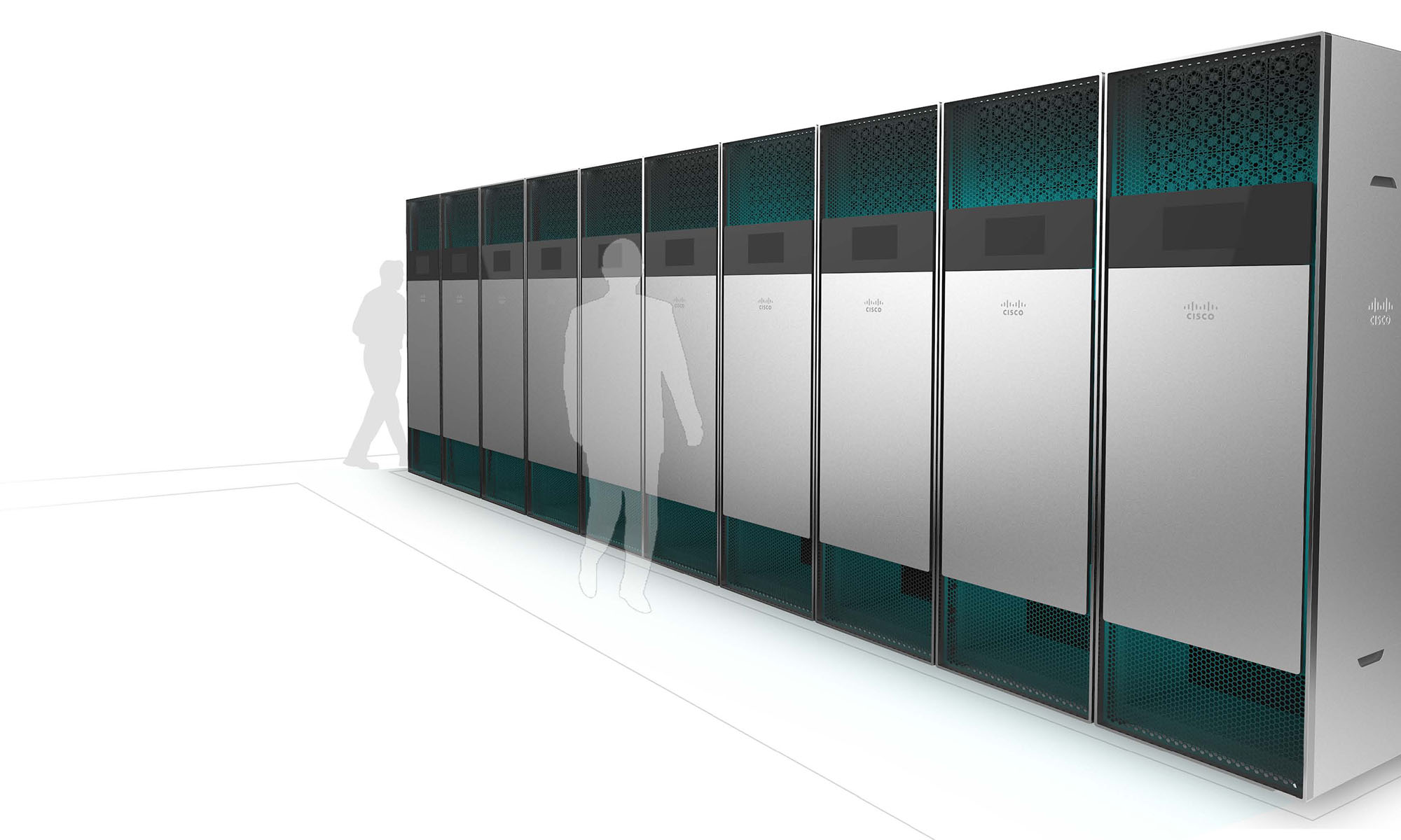
The products fell into two major categories. Those that customers touched, saw, and used every day, and those that lived in a data center or wiring closet. The first group of products had a more consumer feel to match the phones, cable boxes, office routers consumers use. And the core networking products has a more trustworthy and dependable design aesthetic. Both categories shared the same brand DNA and design elements, but their scale and emphasis was applied differently. Together they spoke a flexible language that could be used for any of the products we needed to accommodate.
Celebrating being one company
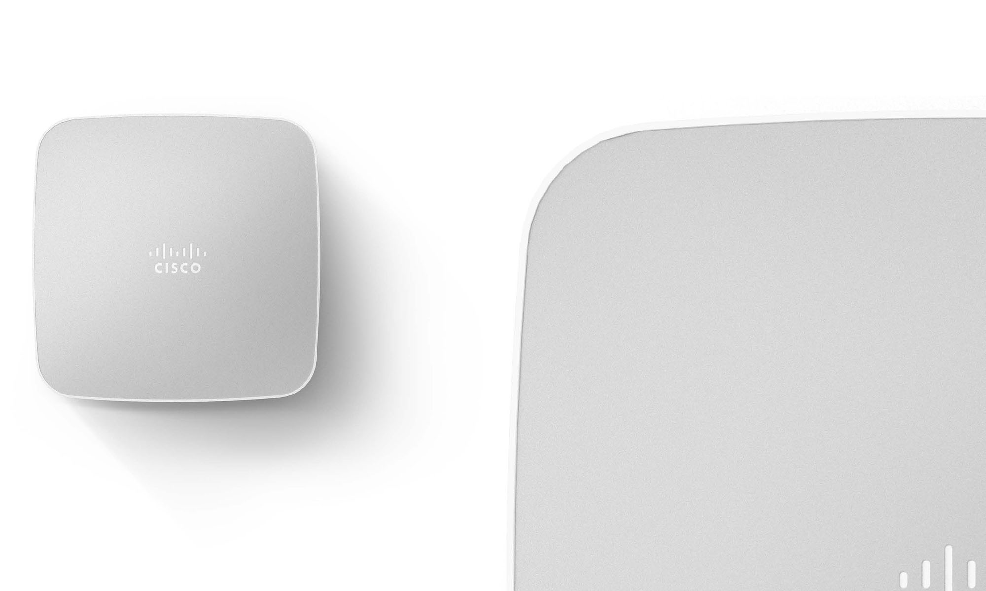
It’s all Cisco inside and out; unlike others, it’s not a branded facade. To show off that fact, we made sure to celebrate our design language and brand in unique ways.
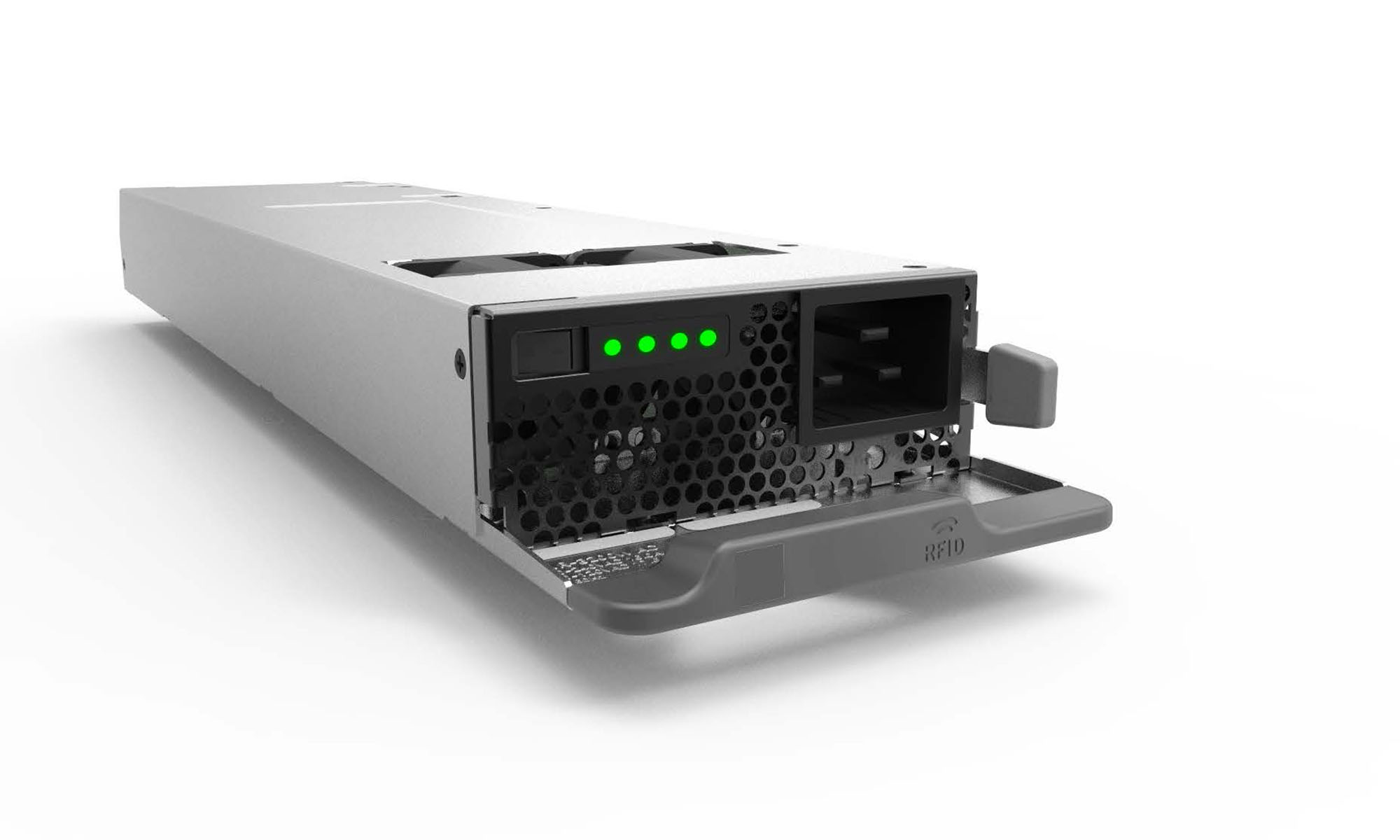
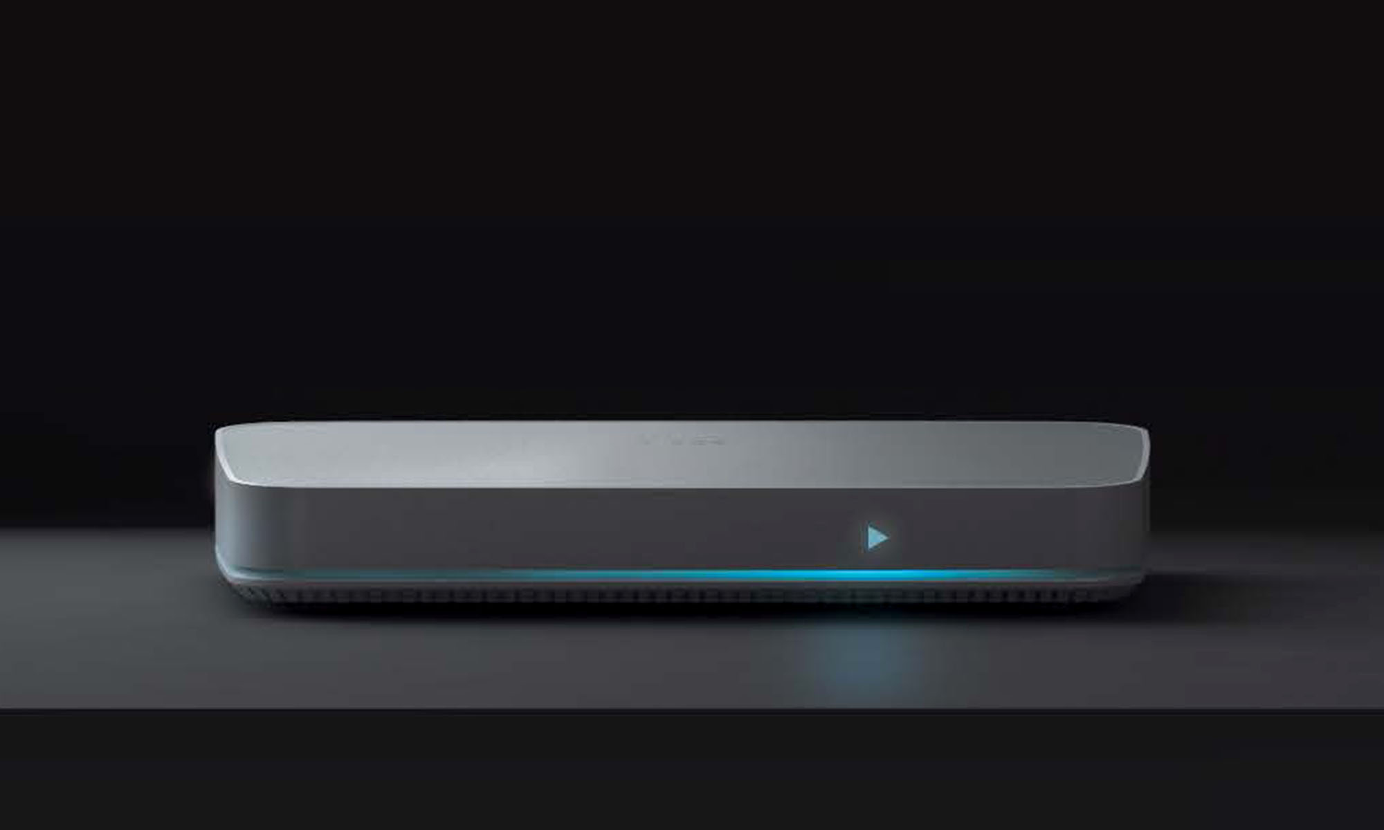
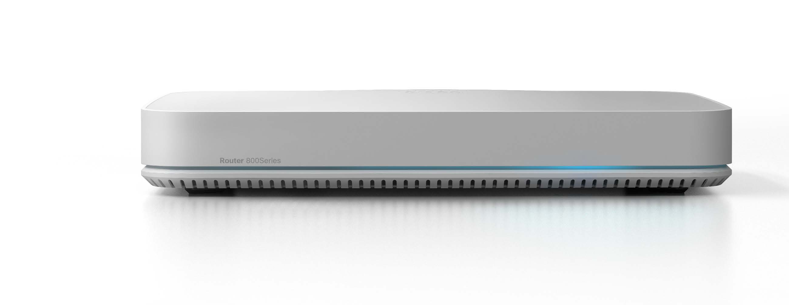
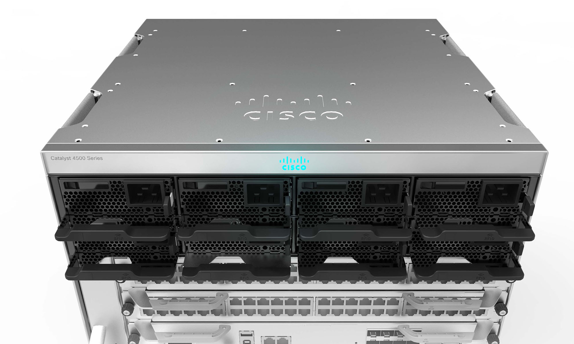
When installing the product, the engineer would see our logo as it went in. When powered on, the logo on the front would tell them it was alive and well with our blue glowing logo (it glows red if things are bad). The ejector handles have the same contour as the pills of the logo. And the thumb screws use the pills for grip texture. The radius of the logo carries across the products.
Focused on the customers
Using the industrial design program as a thought starter and way to open doors to other conversations:
Customer Needs
I briefed engineering teams on the principles of human-centered design. Bringing to the conversation how important it is to understand the customers’ needs and cares. Ensuring that we were designing the products to deliver the most customer value.
Ergonomics
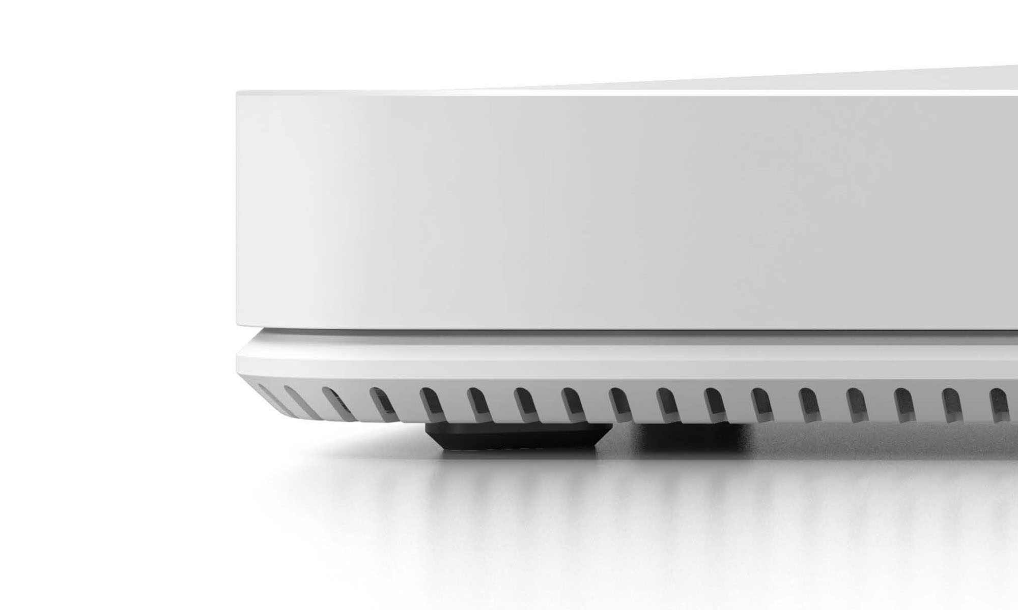
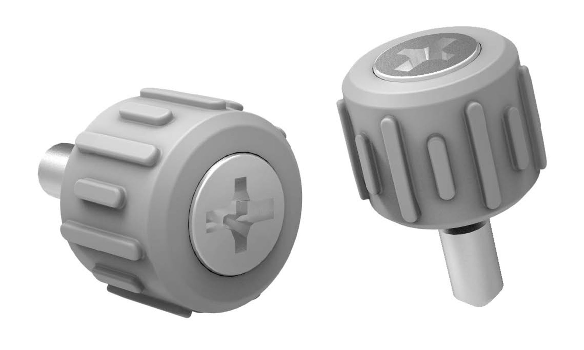
We worked with engineers to identify the core reusable components. You don’t want the act of pulling an ejector handle to cause you pain, or a mounting screw to tear up your fingers. We redesigned both the handle and the screw, making sure they too reflected the brand essence. Details matter. And it doesn’t hurt if you cut costs by aligning the supply chain at the same time.
Preventing Support Cases
We spoke to the support teams and solved the issues we could. Some were simple, like ensuring a sharpie could write on the coating materials. Others required redesigning of core components, or incorporating new technologies that a single team couldn’t afford, like RFIDs in handles. But when applied to an entire product class as part of the industrial design language standards, we pulled off the scale needed to be cost effective.
Long runway
Just like the software program, the adoption and momentum came through executive and grassroots support, using the same federated-governance model. These products take years to develop and can remain in the market for a decade or more. The (almost) impossible part is done. The pipeline is full and now aligned to deliver a unified customer experience. And I was able to bring a human-centered design mindset to the engineering teams. It’ll take time to overpower products already in the market and reclaim the brand’s rightful mindshare, but the ship has already begun turning.